Dr. Thinh Care
Dr. Thinh Care is a comprehensive women’s health and wellness brand dedicated to mothers and babies, offering trusted services from fertility support to spa and general care. With steady growth and thousands of patients choosing its services, the clinic is now establishing a cohesive brand identity—designed to reflect professionalism, build stronger patient connection, and highlight the values of new life, nurturing, and confidence.
ROLE
Brand Design
CLIENTS
Dr. Cap Huu Thinh
Duration
2 months
Logo
At the heart of the design is the silhouette of a mother lovingly embracing her child — a timeless symbol of maternal love and protection. This central figure is gracefully cradled within lotus-like hands, representing both the nurturing support and gentle guidance that Dr. Thinh Care offers to women on their journey to motherhood. The stylized lotus flower carries layered meanings: it signifies new life blossoming into the world — reflecting the miracle of birth — while also alluding to our spa services that provide rejuvenation and well-being for both mothers and their babies

Mother embrace the baby

Nurturing support


Miracle of birth
& our spa service


0.5x
1x


Comprehensive care for women and families — from fertility treatment to prenatal counseling and beyond.

To reflect the holistic and specialized care we provide, Dr. Thinh Care is divided into 3 distinct yet interconnected branches: IVF Services, Mom & Baby Spa, and Postpartum Aesthetic Care. Each branch is represented under one unified brand identity, using a consistent logo design that symbolizes our core mission — nurturing, supporting, and empowering women throughout every stage of motherhood.
By tailoring sub-names and color nuances for each service area, we maintain brand cohesion while clearly communicating our comprehensive and compassionate care offerings.


Colors
Three harmonious colors symbolize the service branches:
-
Calm Sky Blue (#9ACEE7) expresses trust, calmness, and advanced medical support
-
Aqua Mist (#A6E9DF) conveys nurturing care and natural healing
-
Graceful Lavender (#D2B4E8) reflects elegance, recovery, and women’s well-being.
Combined, these tones create a gentle, welcoming identity that embodies professionalism and compassion for mothers and babies.
Calm Sky Blue
#9ACEE7
Aqua Mist
#A6E9DF
Graceful Lavender
#D2B4E8
Soft Ivory
#EAE0C0
Warm Stone
#D3CCB7
Charcole Black
#D2B4E8
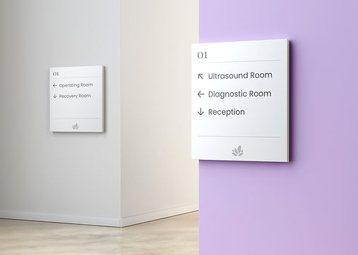
Collateral
The marketing assets for Dr. Thinh Care are designed with soft colors, delicate patterns, and approachable imagery to convey professionalism with warmth and trust. From packaging to stationery and outdoor posters, the cohesive brand identity highlights the clinic’s mission to accompany families on their journey toward parenthood.